Company
The Sting is a Dutch fashion brand with a legacy of 40 years, boasting over 150 stores and multiple online platforms, including The Sting, Costes, Cotton Club, and Hang Eleven. As the brand expanded, maintaining consistency across various digital interfaces became increasingly challenging.
Overview
At The Sting, we embarked on a project to redesign our mobile navigation to make it more intuitive and inspiring. The goal was to accommodate the addition of eight new brands and address the challenges users faced with the existing navigation system. This project aimed to streamline our design and development processes, ensuring a consistent and accessible user experience across all our platforms.
My contribution
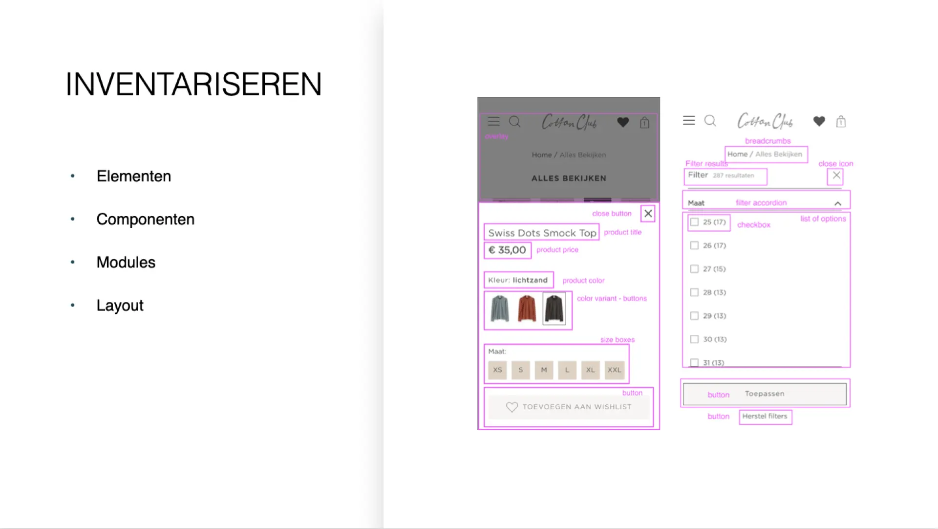
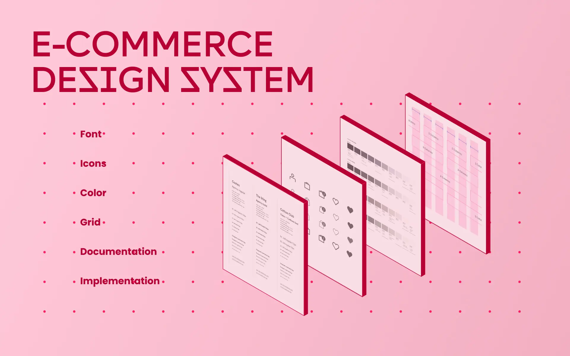
UI Inventory
Library of reusable components
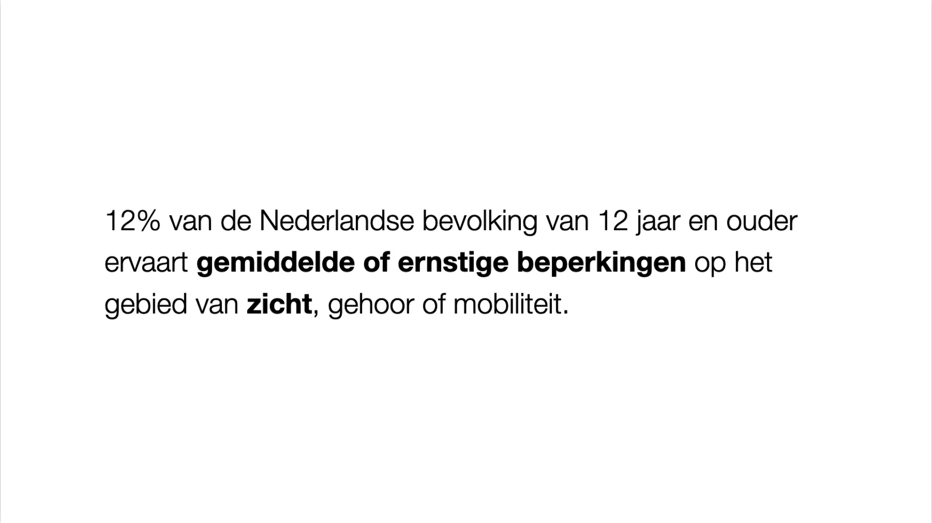
Focus on accessibility standards
Atomic Design principles
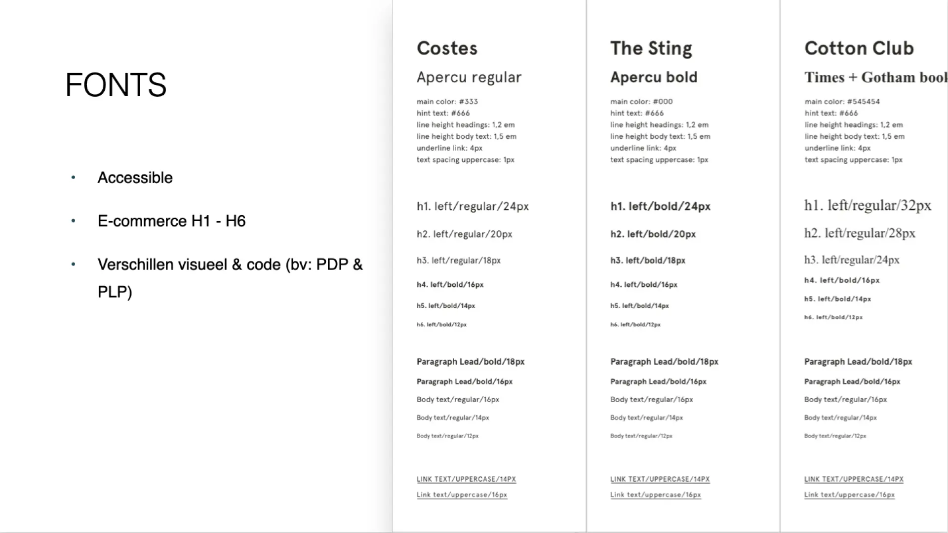
Using H1 - H6 headings
Using 8 points hard grid
Using 4 points soft grid
Documentation in Storybook
Documentation in Zeroheight
Ongoing maintenance
The team
Front-end lead
Front-end developers
UX & UI Design
Ship sites with style.
See blog post →
See blog post →
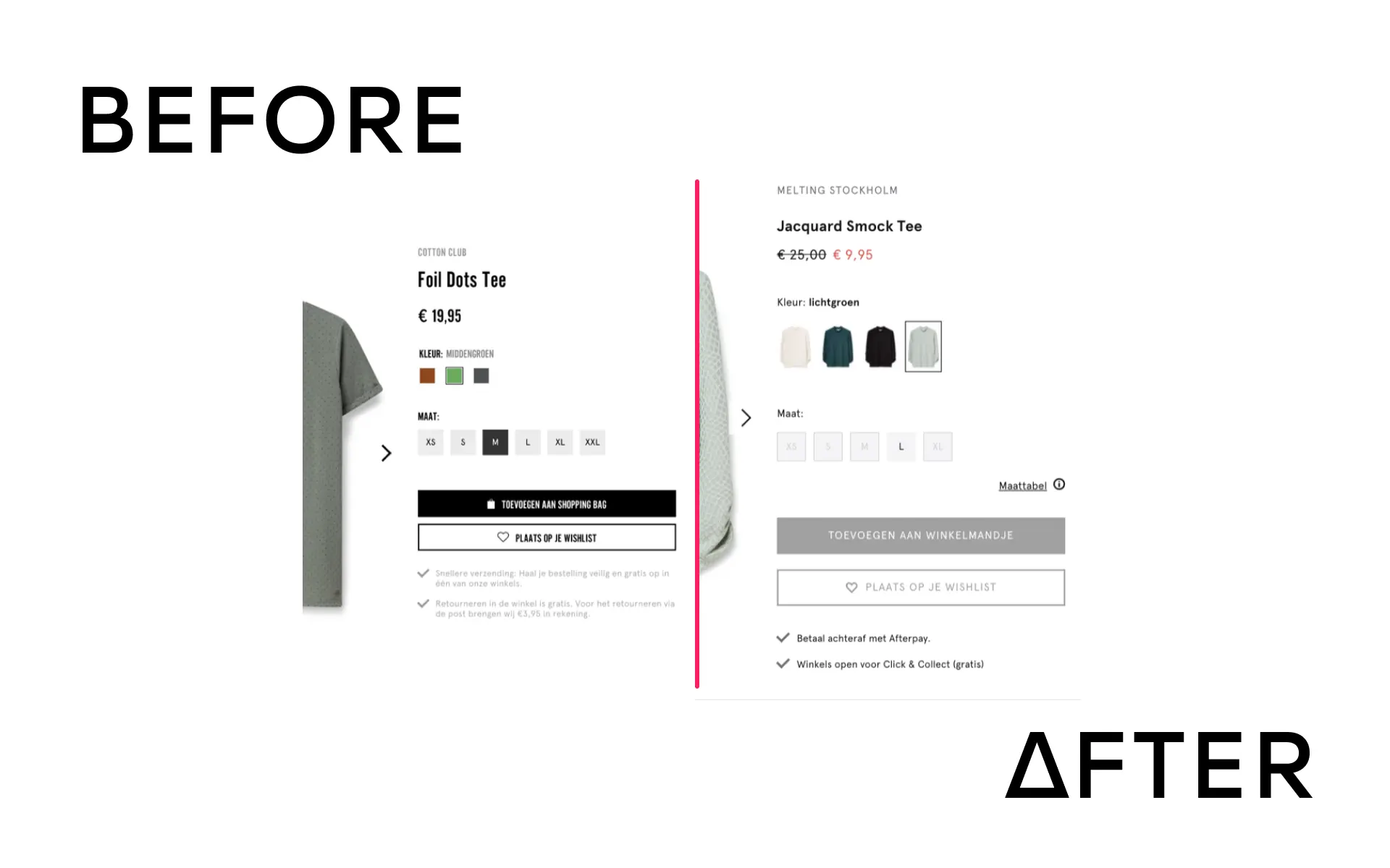
How to design an intuitive mobile menu highlighting brands and improving navigation?
With the rapid addition of new websites and features, inconsistencies in design elements such as buttons, fonts, and colors proliferated. The need for a unified design system became urgent to manage the increasing complexity and ensure a seamless user experience across all platforms.