Company
The Sting is a Dutch fashion brand with a legacy of 40 years, boasting over 150 stores and multiple online platforms, including The Sting, Costes, Cotton Club, and Hang Eleven. As the brand expanded, maintaining consistency across various digital interfaces became increasingly challenging.
Overview
The Sting is a multibrand fashion company with over 150 stores in the Netherlands, Belgium, and Germany, and operates four online stores: The Sting, Costes, The Cotton Club and Hang Eleven. The Sting caters to a diverse audience, primarily between 25 and 35 years old, but online analytics revealed that 50% of the users are over 45.
My contribution
Qualitative user research
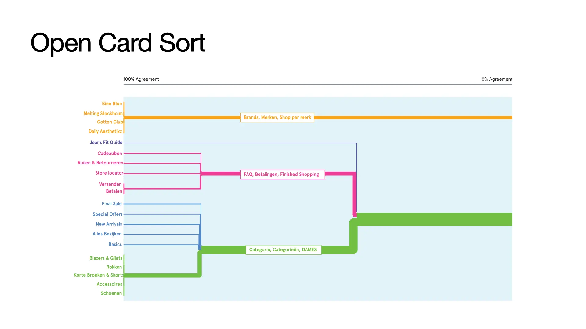
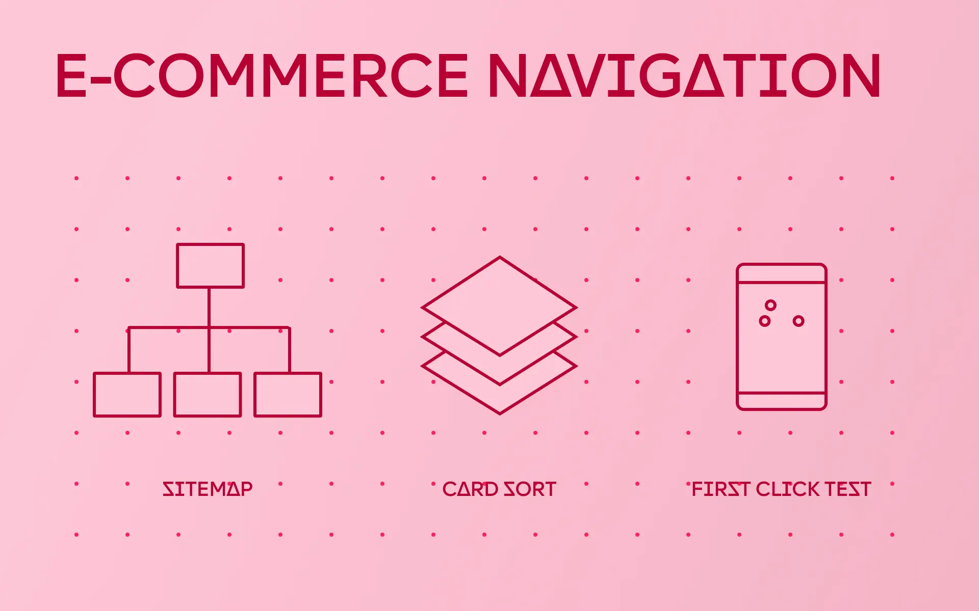
Open card sorting
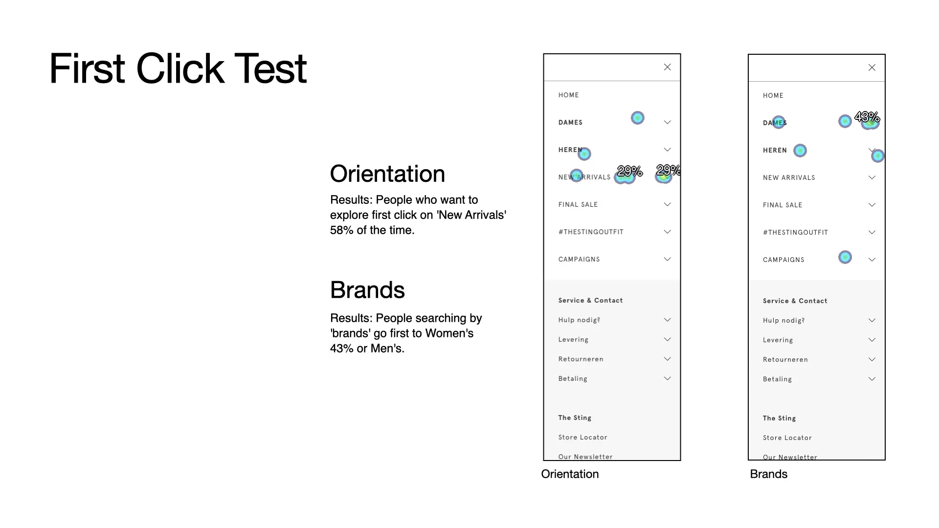
First-click tests
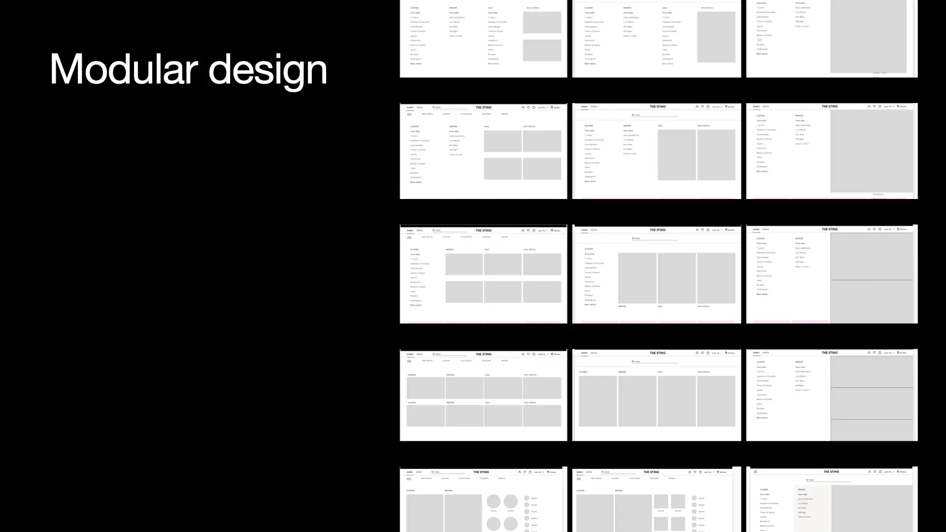
Design of a modular navigation
Parallel design
Responsive design
Use of inspiring images in the design
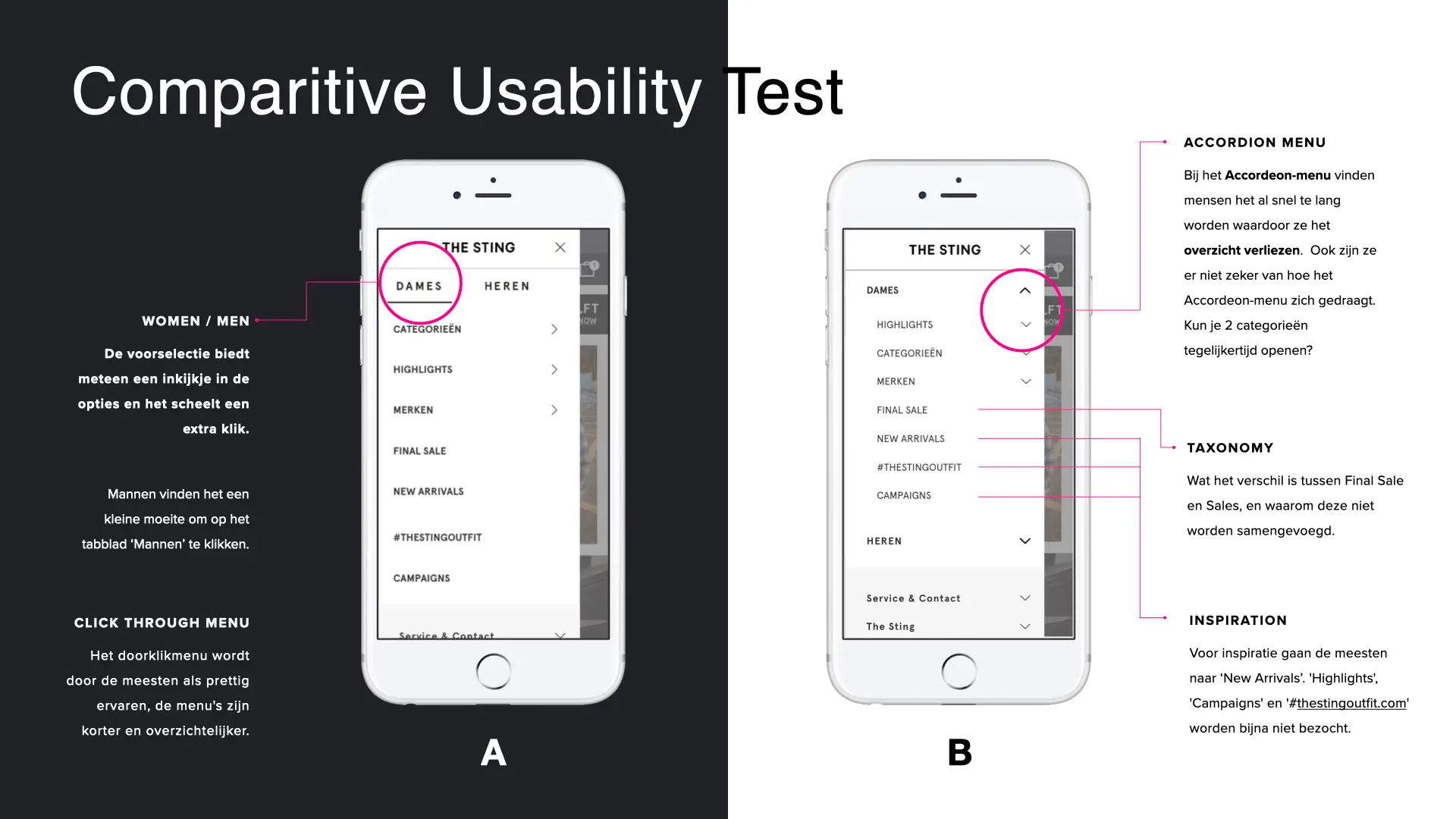
Comparative usability tests
A/B testing
Implementation modular system
The team
E-commerce managers
Front-end Lead
Front-end Developers
Customer Experience
Data Analyst
User Researcher & UX Designer
Ship sites with style.
How to design an intuitive mobile menu highlighting brands and improving navigation?
The Sting faced significant challenges with its online navigation. The previous navigation system, which was based on gender selection had been changed to a category-based system a year earlier. However, with the planned introduction of eight new brands, the need for a more intuitive and inspiring mobile menu became critical. The existing menu was cluttered and confusing, leading to a poor user experience and lower engagement rates.